


With mobile browsing surpassing desktop use, Google has ushered in a new era with mobile-first indexing. This means your site’s mobile version now takes priority in determining how well it ranks in search results. For businesses and website owners, mobile optimization is no longer just a recommendation—it’s a necessity.
At Savit Interactive, we understand the importance of staying ahead in this mobile-first world. This blog will guide you through optimizing your site for mobile SEO, incorporating responsive design SEO, and perfecting your mobile optimization SEO. Let us help you future-proof your website and ensure it thrives in Google’s new mobile-first indexing system.
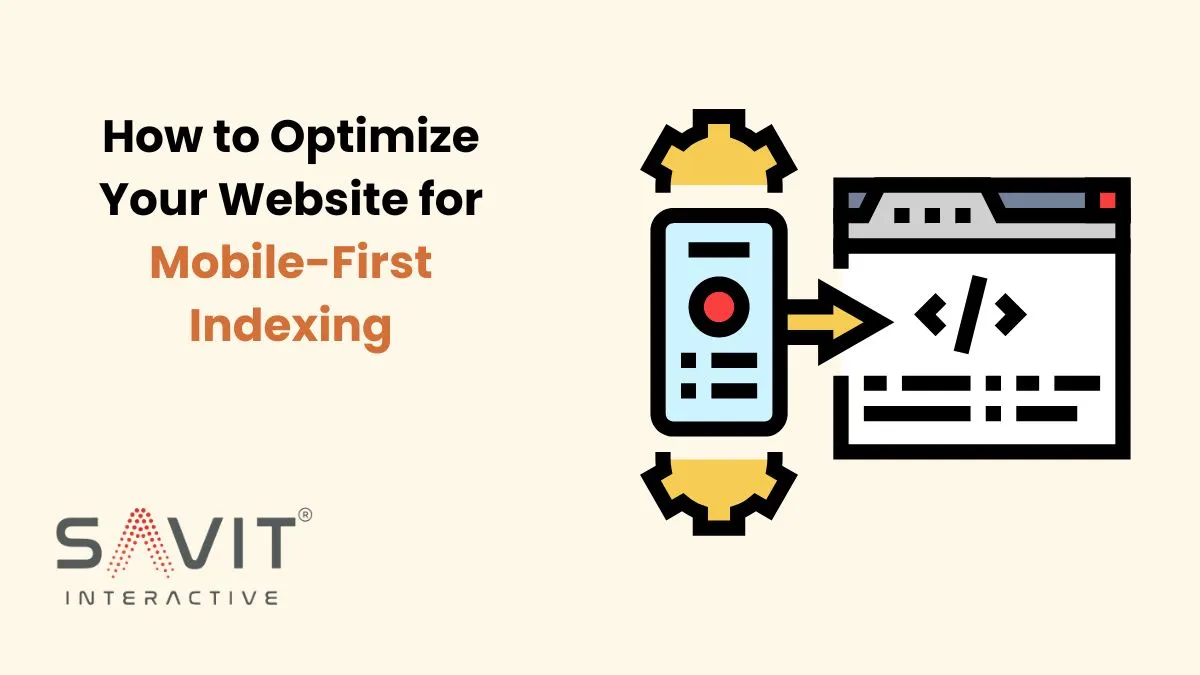
What Is Mobile-First Indexing?
Mobile-first indexing refers to Google’s practice of using the mobile version of a website to rank and index pages. Previously, the desktop version was the primary reference. But as mobile traffic has grown, Google now looks at mobile content first when determining how a site ranks in search results.
Does this mean Google ignores desktop versions? No, but if your mobile version is under-optimized, your rankings could take a hit, even if your desktop version is perfect. Hence, optimizing for mobile is not just a good-to-have—it’s a must.
Why Mobile SEO Matters
Mobile SEO optimizes your website for mobile users and boosts search engine visibility. It’s vital because Google ranks sites based on mobile performance.
Here are some reasons why mobile SEO is essential:
- Increased Mobile Usage: Statistics show that over 60% of global internet traffic comes from mobile devices.
- Google’s Focus on Mobile Experience: Google prioritizes mobile-friendly sites. A poor mobile experience can lower your rankings.
- Better Conversion Rates: Mobile-optimized sites convert better. They offer a smoother user experience.
Key Factors in Mobile-First Indexing
1. Responsive Design SEO
One of the most effective ways to prepare for mobile-first indexing is by adopting a responsive design SEO approach. Responsive design makes your website adjust to different devices. It provides an optimal view on phones, tablets, and desktops.
Google recommends responsive design. It serves the same content to all users, regardless of device. This makes it easier for Google’s crawlers to index your pages and ensures a consistent experience across platforms.
Key elements of responsive design SEO include:
- Flexible Grids: Use fluid grids that adapt the layout based on screen size.
- Media Queries: Implement CSS media queries to optimize styles for different devices.
- Flexible Images: Ensure images scale properly to fit the screen without affecting load times.
2. Mobile Optimization SEO
Responsive design helps with layout. Mobile SEO focuses on improving your site’s performance and usability for mobile users. Here are some best practices for mobile optimization:
- Reduce Load Times: Mobile users expect websites to load within 3 seconds. Slow load times can lead to higher bounce rates and lower rankings. Use techniques like compressing images and minimizing JavaScript. Also, leverage browser caching. They will speed up your site.
- Optimize for Touch: Make sure that your site’s buttons, links, and forms are easy to use on touchscreens. Avoid elements that are too close together and ensure that tap targets are large enough for users to interact with.
- Avoid Intrusive Pop-ups: Pop-ups can be incredibly annoying on mobile devices, especially if they take up the whole screen. Google penalizes sites with intrusive pop-ups, so it’s best to avoid them or make them easy to dismiss.
- Readable Font Sizes: Make sure your text is legible without zooming in. The minimum recommended font size for mobile is 16px.
3. Content Consistency Between Mobile and Desktop
To keep rankings under mobile-first indexing, your mobile site must have the same high-quality content as your desktop site. This includes text, images, and videos.
Many website owners make the mistake of stripping down content for mobile devices to speed up load times. However, if the mobile version lacks the desktop version’s content, it could hurt your rankings. Instead, focus on optimizing how this content is delivered.
4. Structured Data and Metadata
Make sure that your structured data is present on both desktop and mobile versions. Structured data helps Google understand your site better. This can lead to rich snippets and higher rankings. Also, keep your metadata—like title tags and descriptions—consistent across versions.
5. Mobile-First UX
Beyond technical optimizations, the user experience (UX) for mobile visitors should be a priority. A seamless mobile SEO strategy means offering a clean, intuitive design that keeps users engaged. You want to focus on:
- Simple Navigation: Avoid complicated menu structures. Use easy-to-access navigation that works well on smaller screens.
- Clear Call-to-Actions (CTAs): Ensure your CTAs are prominent and easily clickable on mobile devices.
Testing Your Mobile Optimization
Once you’ve optimized your site for mobile-first indexing, it’s crucial to test how well it performs. Google has a free tool, the Mobile-Friendly Test. It checks your site and highlights issues with its mobile friendliness.
Also, use Google Search Console. It helps you monitor how Google’s crawlers view your site. It can also identify areas needing optimization.
Conclusion
With more users on mobile, adopting mobile-first indexing and mobile SEO is crucial. Focus on responsive design SEO and mobile optimization SEO. This boosts your search ranking and improves the mobile user experience.
If your website is not yet optimized for mobile, now is the time to make the necessary changes. A mobile-optimized site is no longer a luxury but a necessity for online success in today’s fast-evolving digital landscape.
Supercharge your online growth with Savit Interactive! Whether it’s driving traffic or boosting conversions, our SEO experts are here to help you lead your market. Take the first step today—let’s talk!